A new productivity app ditched standard UI/UX patterns and went viral, what it means for digital branding today.
The App That Refused to Look Familiar
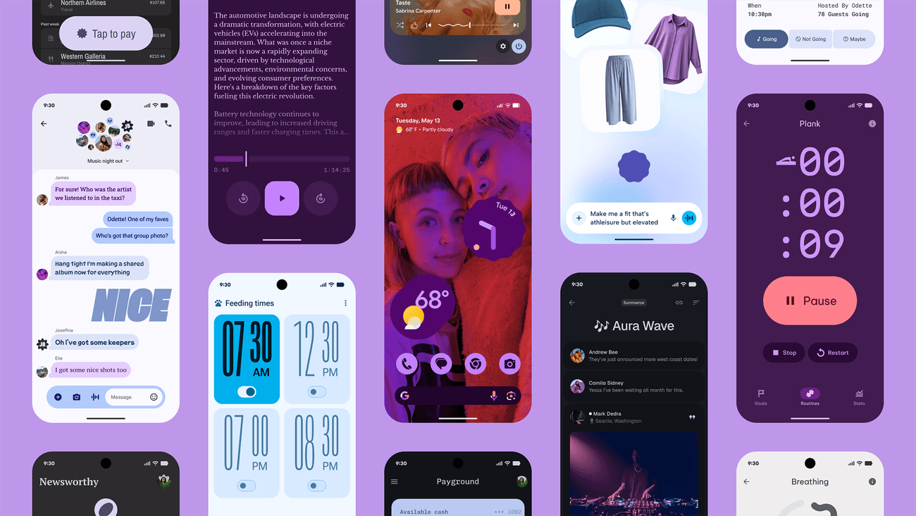
In a sea of minimal, copycat productivity apps, "Drift" did the opposite — opting for loud gradients, kinetic typography, and a “tap-and-drag” navigation that felt more like a game than a planner. Instead of embracing conventional Material Design or Apple’s Human Interface Guidelines, Drift leaned into what felt good rather than what looked right. The result? A design that broke the grid — and the internet.
Anti-UX: Why Breaking Rules Worked
What traditionalists called "confusing,” Gen Z users called “fun.” Drift’s UX challenged the norm — replacing menus with floating gestures and relying on swipe physics instead of icons. While it defied Jakob’s Law (users prefer familiar patterns), it nailed a different principle: emotional delight. Drift gamified productivity, turning habit-tracking into a dopamine-driven experience.
Designing for Shareability, Not Simplicity
Drift's unexpected interface quickly went viral on TikTok and Instagram. Screenshots of neon dashboards, weirdly satisfying animations, and swipe-controlled interactions flooded design feeds. The UI wasn’t optimized for onboarding — but it was built for curiosity and virality. Every screen looked like a meme. And that was intentional.
A New Kind of Branding: The Interface Is the Identity
Unlike most apps that brand through logos and tone of voice, Drift turned interface chaos into brand language. No logo? No problem. The app’s unique swipe mechanics and weird bubble buttons became its signature. The interaction was the identity — and users instantly recognized it.
Community First, Convention Later
Drift launched in closed beta on Discord, letting users vote on which quirky animations should stay or go. The community helped shape the product's rebellious nature — and because users felt ownership, they forgave the steep learning curve. Feedback wasn’t just welcomed, it was embedded into the product’s DNA.
What This Means for Future App Branding
Drift proved that today’s users don’t always want seamless — they want distinctive. In a world of safe interfaces, rule-breaking design stands out. Emotional resonance, visual surprise, and a sense of play now matter more than strict usability. Branding isn't just your logo — it’s every swipe, tap, and scroll.